You know why I like anime other than the obvious need for escapism into great stories? Because it is a celebration of how beautiful animation and art can be. They can do some just absolutely mind-blowing, eye-exploding things these days.
But not always.
It’s not always some Todoroki v. Midoriya school festival fight, episode 19 of Demon Slayer, Violet Evergarden where the animation carries the boring bits type thing where the visuals are just literally unforgettable.
Sometimes it’s bad. Let’s talk about all the character that got the stubby end of the pencil and the drunk end of the creative thought.
Worst Anime Character Designs
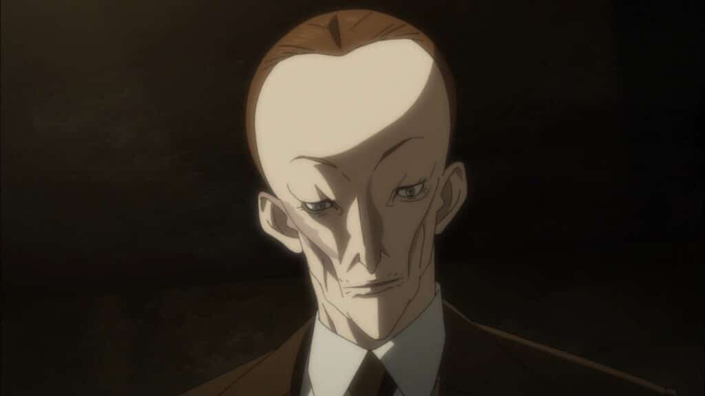
Howard Marks From Joker Game
…Like, I know there are people out there with giant foreheads that definitely should grow their hair longer to cover them. I get that. However, when everyone else in your series looks normal, this guy that ends up looking like a thin man from my nightmares just doesn’t fit in.
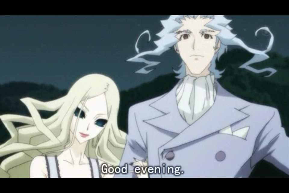
The Vampires in Shiki
You know how since the beginning of Anne Rice vampire novels that every vampire had to be the most edgiest edgelord that ever sat on the edge? Shiki stays true to that. You can probably play spot the vampires in this show due to how ridiculous their character designs are. Even the characters that are recruited into the ranks of the undead undergo a change of design where they look ridiculous.
It’s not even the art style, that I can respect, but let’s be real. If there was a new couple up in the mansion on the hill wearing clothes from the 18th century, they’d look pretty suspect when a bunch of people started dying.
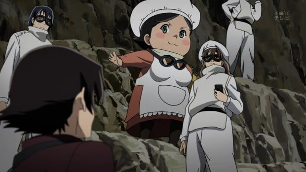
8th from Future Diary
The loving matron of an orphanage has a character design that is not uncommon in anime. It is just uncommon in their anime. She is supposed to be motherly, yes. Yet, you can’t convey that without making her look like she is literally inside a mascot suit walking around? She does not fit in with the other realistically designed characters, which I find both odd and also comical when I watch her walk.
Honorable mention is also 12. I get that he doesn’t need to see and as such has a mask that prevents that. However, does he also need to not breathe? Because it looks like he wouldn’t be able to breathe.
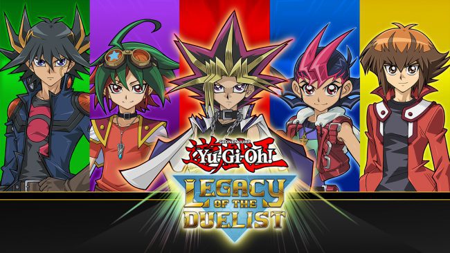
Yugioh Characters of All Kinds
You know how Yugi’s hair in the first series was a little odd? Yeah, it is like that became a staple of the series, but every time they used it, it got a bit more extreme. Furthermore, it extended past the main character to almost every character. Like Yugi and his spiky colored hair became an infectious plague in that universe and now you can no longer play “spot the main character” in it because they all look completely anime main character to the extreme.
Unless it is secret commentary on how we are all the main character in our own story, it’s gotten out of hand.
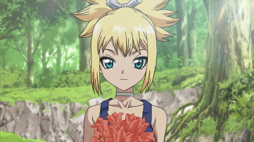
Kohaku (and Several Girls) in Dr. Stone
This is like, the smallest nitpick, but her eyes are too far apart. Other girls in the series also suffer from this resting derp face as well while it really excels in creating cool-looking men. What I suspect happened is that you expect girl faces to be softer, so you can’t add also those little detail lines around the eyes or create more defined noses. It makes the whole space look super empty and far apart.
This is definitely more on an art style nitpick rather than a design nitpick, I’ll admit. Alternatively, design-wise more effort could have been put into fixing that derp face.
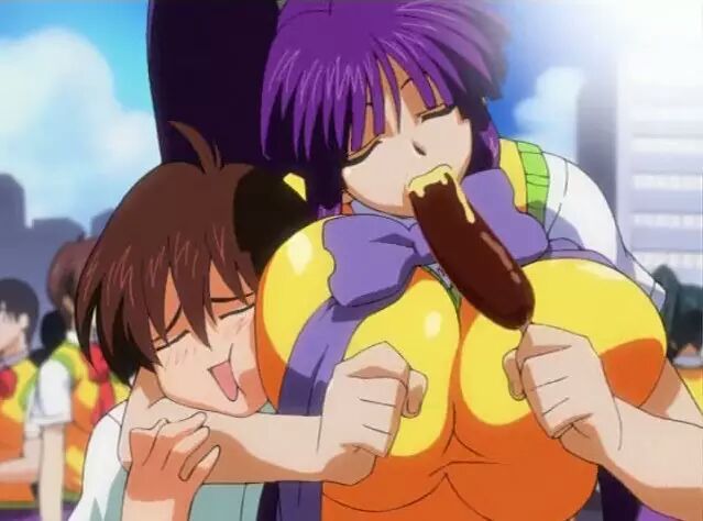
Everyone in Eiken
The goal in Eiken was to create a sexually suggestive anime with literally every breast size in existence. From the flat-chested loli to the fanart of a 13-year-old boy where the whole page is just boob, they have it all. A lot of harem anime series have done it before, but they at least try to create an actual show and personality for their characters other than “lul I got chest meat.”
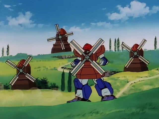
Nether Gundam From G Gundam
I’m not so much into Gundam, but I did watch a lot of it for this site and there is one Gundam that visits me in by dreams, The Nether Gundam from G Gundam. Actually, a lot of Gundams from G Gundam.
Why?
No, really. Why? Does someone know?
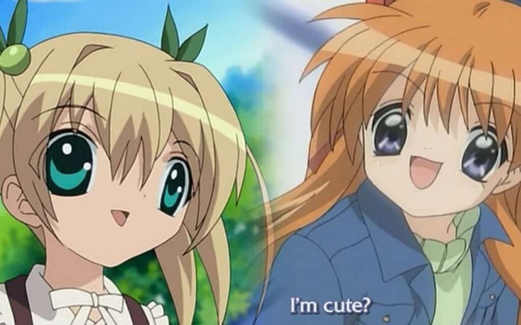
Kanon 2002
Kanon was remade in 2006 by Kyoto Animation and it has all but buried the 2002 version by Toei. But the internet remembers. You know the derpy character always show up when you mention bad character designs? (Like the one that’s the header for this article!?) That’s them. Key has a passion for large eyes that takes over a person’s face, but that’s more art style than design. These, however, are when the eyes are basically the character because it is all you see…In your nightmares.
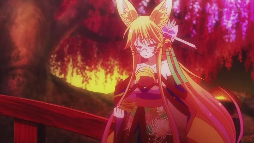
Miko From No Game No Life
This is what would happen if you let a weeb create a character. You know, make her a cat girl (or “werebeast” for fanciness’ sake), slap some whiskers on there, and a monocle for extra style points.
There is such a thing as adding too much to a character to make them seem interesting and different.
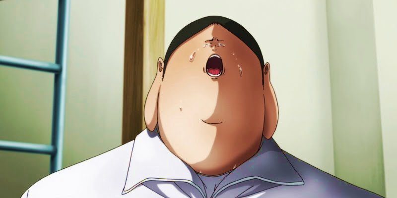
Andou from Prison School
Did you know that I wanted to put Promised Neverland on here because they have that smooshed face on such a large headspace? I was like, “No, that’s not design, that’s just art style.” However this monstrosity, isn’t art style. The made him like this. They gave him Buddha ears, that chubby body, and that teeny face. It creates some good comedy, yeah, but that poor soul. It’s like the pug dog of anime characters.
Do you have any more bad character designs? Let…fans(?) know in the comments section below.
